
When a webpage takes forever to render, the knee-jerk reaction for most developers is to inspect their JavaScript bundles, rewrite React hooks, or tweak server response times. But more often than not, the real bottleneck isn’t hidden inside your code—it’s sitting right there in your media folder. You can write the cleanest, most performant code on the planet, but if your homepage is pulling 4 megabytes of uncompressed assets across the wire, your site is still going to feel sluggish.
According to HTTP Archive data, images account for roughly 40% to 50% of the median webpage’s total weight. On image-heavy sites like online stores or real estate platforms, that ratio climbs even higher. What makes this frustrating is that most of these files are anywhere from two to five times larger than they need to be. It’s rarely a conscious choice to prioritize extreme quality; usually, someone simply uploaded raw camera files or stock photos directly into the CMS without resizing or compressing them first.
Where Does All That Weight Actually Come From?
Let’s break down the actual numbers. The median web page in 2025 weighs around 2.3 MB on desktop and 2.1 MB on mobile devices. Out of that total payload, images alone swallow between 900 KB and 1.2 MB. That means media files represent over half of everything your visitors have to download before they can view your page properly.
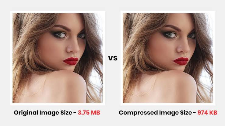
JavaScript often gets most of the blame when performance discussions happen, but scripts primarily consume CPU time while parsing, compiling, and executing. Images hit a completely different bottleneck: the network itself. They consume raw bandwidth, delay rendering, and on spotty mobile connections, turn a fast 2-second load into an agonizing 8-second wait. Most engineering teams don’t even realize that a single 4000-pixel hero shot on their landing page is responsible for most of their slowdown.
Why Google Penalizes Slow Images
Search engines care deeply about how fast your site loads for real users. Google uses Core Web Vitals as a direct ranking signal, and when it comes to visual assets, the metric to watch is Largest Contentful Paint (LCP). LCP tracks how long it takes for the largest visible element in the viewport to fully render. On almost every modern layout, that key element is an image—whether it’s a hero banner, a featured product photo, or a background visual.
Google sets a strict target for a “good” LCP score: 2.5 seconds or faster. Trying to hit that mark while transferring a 2 MB raw JPEG image over average cellular connections is virtually impossible.
This isn’t just theoretical. It’s common to see sites undergo a slick visual redesign only to watch their search rankings drop weeks later. The site looks sharper, but because the new photography was uploaded in raw resolution, LCP scores tanked and pushed the site below Google’s Core Web Vitals thresholds.
The 4000px Image in a 400px Container
One of the most frequent performance missteps is dropping ultra-high-resolution files straight onto a web page without scaling them down.
When you place a 4000-pixel image into a 400-pixel display container, the browser still has to download the complete multi-megabyte file before shrinking it down on screen. You’re forcing your user’s device to download ten times more data than it can actually display.
| Image Width | File Size | Size Reduction |
| 4000px (Raw original photo) | 1.5 MB | 0% |
| 800px (Optimized for Retina displays) | 120 KB | 92% |
Notice that an 800-pixel width is ideal for a 400-pixel layout box because it accommodates high-density Retina screens (which run at 2x pixel density) while stripping out millions of invisible pixels. If you repeat the unoptimized mistake across a page with 15 photos, your page payload easily balloons past 18 MB.
The True Cost of Neglecting Optimization
Uncompressed assets don’t just create a sluggish feel—they actively cost you money and visitors:
- Higher Bounce Rates: Google’s research highlights that as page load time goes from 1 second to 3 seconds, the probability of a user bouncing increases by 32%. If load time stretches from 1 to 5 seconds, bounce probability leaps by 90%.
- Penalizing Mobile Users: Over half of all global traffic comes from mobile devices, many on capped or pay-per-gigabyte mobile data plans. Forcing someone to download a 5 MB page when 500 KB would suffice wastes their paid data allowance.
- Wasted Infrastructure Spending: Every unnecessary byte gets multiplied by your total traffic volume. A website serving 100,000 visitors per month with 2 MB of excess image overhead per page wastes roughly 200 GB of bandwidth monthly. At scale, those cloud bandwidth fees add up quickly.
- SEO Disadvantage: When your competitors compress their media and score green on Core Web Vitals while your LCP stays sluggish, search engines will naturally favor their pages in search results.
How to Fix It (In Order of Impact)
If you want to speed up your site quickly, tackle image optimization in this order:
1. Right-Size Before Compressing
Resizing image dimensions to fit your actual display container should always be step one. If your layout never displays an image wider than 800px, serving a 3000px source file is pure waste. Aim for twice the container width to account for Retina displays (e.g., an 800px asset for a 400px box) and strip out the extra pixels before applying compression algorithms.
2. Modernize Your Formats
Choosing the right format produces dramatic gains:
- WebP: Delivers 25% to 35% smaller file sizes than JPEGs at equivalent quality, supports transparency, and enjoys universal browser support today.
- AVIF: Offers 30% to 50% smaller file sizes compared to JPEGs. While encoding takes slightly longer, browser support is widespread enough that it makes a top-tier choice for progressive enhancement.
- PNG: Reserve strictly for graphics requiring lossless visual clarity or fallback transparency. Using PNG for standard photography is almost always a mistake.
- SVG: Ideal for logos, icons, and vector illustrations. SVGs scale infinitely without quality degradation while maintaining tiny file footprints.
Tip: Use the HTML <picture> element so modern browsers automatically download AVIF or WebP while legacy browsers fall back to standard JPEGs.
3. Apply Selective Lazy Loading
Lazy loading defers downloading media until the user actually scrolls near it. Adding loading="lazy" to image elements below the fold gives instant speedups on long, visual pages.
Golden Rule: Lazy load everything below the fold. Keep primary hero assets above the fold loaded eagerly with high priority (
fetchpriority="high") so your LCP element renders without delay.
Understanding Diminishing Returns
When optimizing media, focus on big wins first. Cutting a page’s total image weight from 3 MB to 300 KB completely alters performance. Trimming that same page from 300 KB to 250 KB is barely noticeable to visitors or search engines.
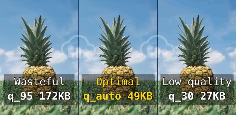
- Right-sizing dimensions: Delivers an immediate 60% to 80% reduction (make this your first priority).
- Format conversion (JPEG to WebP/AVIF): Unlocks another 25% to 40% gain.
- Quality tuning (e.g., lowering quality from 85 to 75): Yields an extra 10% to 20%.
- Chasing the final 5%: Rarely worth the engineering hours unless you operate at massive hyperscale where every gigabyte translates directly into significant cloud bill savings.
If your total image payload stays under 500 KB per page and your LCP stays under 2.5 seconds, you’re in great shape.
Quick Optimization Checklist
- Resize: Output images at 2x max display size for high-DPI screens.
- Convert: Use WebP or AVIF as your default web formats.
- Lazy Load: Defer below-the-fold media; eager-load above-the-fold hero assets.
- Preserve: Keep high-resolution original master files in cold storage for future re-exports.
Leave a Reply