
When a Shopify store starts running painfully slow, store owners usually point fingers at their theme or suspect a rogue app. But nine times out of ten, the real culprit is much simpler: someone uploaded an uncompressed 14MB homepage banner straight out of Photoshop or Canva at 8000×5000 pixels.
Shopify won’t stop you from doing this. It will happily host that massive file and attempt to deliver it to every phone that hits your site.
While Shopify’s built-in media pipeline handles a lot of heavy lifting—like CDN routing and on-the-fly resizing—it operates on a strict “garbage in, garbage out” rule. Whatever file you drag into the admin becomes the permanent source of truth. If your original upload is bloated, every variant Shopify generates inherits that extra baggage.
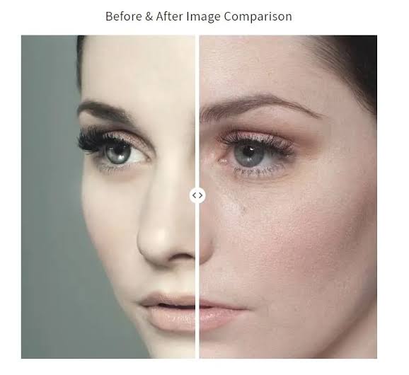
What Shopify Handles Automatically
Out of the box, Shopify’s media infrastructure takes care of three key performance tasks behind the scenes:
- Global CDN Distribution: Every photo you upload is pushed across Shopify’s Cloudflare-powered content delivery network. Whether a customer opens your site in Tokyo or Toronto, their browser pulls image files from a nearby edge server without any manual setup.
- Automatic WebP Conversion: If a visitor’s browser supports modern image formats like WebP (which almost all do today), Shopify converts JPEGs and PNGs on the fly. This format swap alone cuts roughly 25% to 30% off raw file size.
- Dynamic Resizing via URL Parameters: Shopify can scale image dimensions on demand using URL modifiers (like
?width=600). This means you don’t need to manually create 5 different dimension copies of every product photo—Shopify generates scaled versions as requested by your theme.
Where Shopify Leaves You Hanging
Despite those automated features, Shopify doesn’t touch the internal efficiency of your source files. Here is what the platform skips entirely:
1. No Pre-Upload Lossy Compression
When you feed Shopify a 5MB JPEG, it uses that exact file to generate every smaller variant. While changing URL parameters resizes the pixel grid, Shopify does not aggressively re-compress the underlying image data. A poorly compressed 2048px source file leads directly to poorly compressed 600px mobile derivatives.
2. No Smart Cropping or Subject Detection
Shopify’s dynamic scaling is purely math-driven: shrink dimensions while locking the aspect ratio. It won’t detect your product to center it, it won’t trim empty padding, and it won’t re-frame a wide desktop banner into a vertical crop for mobile screens. Subject framing is left entirely to your media editing or theme CSS.
3. No Automatic srcset for Custom Sections
In standard product grids and collection pages, Shopify’s default Liquid themes handle responsive images relatively well. But as soon as you build custom theme sections—a homepage hero, a lookbook, or customer review cards—you have to tell the browser which image sizes to load across different screen widths. In practice, custom theme code often hardcodes a single fixed image size, forcing mobile shoppers to download full desktop-resolution files.
Preparing Images Before You Hit “Upload”
To keep page load speeds fast, every file should be prepped before reaching the Shopify admin:
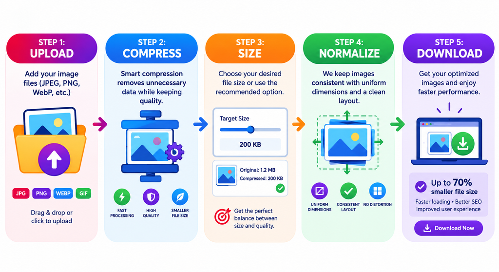
- Compress & Strip Metadata: Run photos through a dedicated compression tool to remove EXIF data and apply lossy compression at an 80–85 quality setting. Stick to standard JPEGs for regular photography, and reserve PNGs exclusively for images that genuinely require transparent backgrounds.
- Right-Size Your Source Dimensions: Don’t upload native camera resolutions. Scale files to match their largest actual display size on your store:
- Product Photography:
2048 x 2048 pxoffers plenty of resolution for full-screen zoom widgets while giving Shopify’s CDN clean headroom for thumbnail generation. - Collection Banners:
1920 pxwide easily covers standard desktop viewports. - Blog & Article Content:
1200 pxwide fits wide-reading containers without wasting bandwidth.
- Product Photography:
- Lock Down Catalog Dimensions: Mixing aspect ratios (e.g., using a
2048x2048image for one product and an1800x2400image for another) forces browsers to constantly recalculate layout dimensions during loading. Keeping catalog dimensions consistent prevents sudden page jumps, keeping your Cumulative Layout Shift (CLS) score in check.
Smart Tweaks for Product Photography
Background complexity and studio lighting play a surprisingly big role in final file sizes:
- Clean White Backgrounds vs. Lifestyle Settings: Complex textures like wood grain, leaves, or fabric require far more data to store. A product shot on a clean white background can easily compress down to 80KB, whereas the same product shot in a detailed lifestyle environment might sit at 250KB. Use clean white shots for high-traffic collection grids, and save heavier lifestyle shots for individual product gallery slides.
- Consistent Studio Lighting: Photos shot with uniform lighting and exposure levels compress far more predictably in bulk than a mix of phone snapshots, vendor graphics, and studio lighting.
Theme Code: image_tag vs. img_url
If you edit theme files or build custom Liquid sections, using the right Liquid helpers makes a massive difference:
The Modern Standard: image_tag
image_tag automatically outputs a fully formed <img> element equipped with responsive srcset rules, explicit width and height attributes (to prevent layout shift), and native lazy loading.
Code snippet
{{ product.featured_image | image_url: width: 600 | image_tag:
   loading: 'lazy',
   widths: '200,400,600,800' }}
The Legacy Method: img_url
The older img_url filter simply returns a plain URL string. It offers no automatic responsive behaviors unless you build out the entire srcset structure manually.
HTML
<img src="{{ product.featured_image | img_url: '600x' }}" alt="{{ product.title }}">
Are Third-Party Optimization Apps Worth It?
Shopify’s App Store is packed with image optimization tools, but they aren’t always necessary:
- Bulk Compression Apps: Valuable if you inherit an established store holding thousands of historical, uncompressed uploads. They batch-process existing catalog media without requiring manual re-uploads.
- JS-Based Proxy Apps: Be cautious with apps that inject JavaScript to intercept image loading and reroute traffic through a third-party CDN. The script must download, parse, and execute before images start rendering, which can end up slower than Shopify’s built-in Cloudflare setup. Additionally, if the app rewrites image URLs in your theme, uninstalling it can leave broken image links.
Rule of Thumb: Building a new store? Compress your images before uploading and skip app subscriptions altogether. Cleaning up years of bloated legacy uploads? Run a one-time bulk pass with an app, then uninstall it once your workflow is clean.
Case Study: Dropping LCP from 8.1s down to 2.3s
Fixing an unoptimized Shopify homepage with a bloated 14MB hero banner typically takes less than two hours of targeted tweaks:
- Pre-compressing and scaling all hero assets.
- Refactoring banner Liquid markup to use
image_tagwith accuratewidths. - Adding critical image preloading for above-the-fold content.
- Enabling native lazy loading across lower product grids.
The Impact
On a throttled mobile network test, total page payload dropped from 18MB down to 1.4MB. Overall homepage load times plummeted from 11 seconds to 3.2 seconds, while Largest Contentful Paint (LCP) improved dramatically from 8.1 seconds down to 2.3 seconds—all without adding extra apps or recurring software costs.
Leave a Reply